AI text effects turn plain words into eye-catching visuals in seconds. For digital creators, they are a fast way to make a headline, thumbnail, or post pull in a reader. You type a short prompt, the tool styles your words, and a few ready-to-use options come back.
Quick, visual content keeps growing. More than half of B2B marketers now use AI to help create images and video, according to the Content Marketing Institute. Independent creators are right beside them. This guide covers what these tools do, how to use them, and how to keep your text readable.
What Are AI Text Effects?
AI text effects are AI-generated styles applied to your words, turning plain letters into 3D, neon, metallic, glass, or textured type from a short written prompt. An AI text effect generator reads your description, matches it to visual patterns, and renders your words in that style, usually giving you a few versions to choose from.
The appeal is speed. You do not need design software or a photo editor. Type “melting gold letters” or “green leafy vines,” and the tool builds it. Common looks include 3D, neon, glass, chrome, and fire. It is AI typography without the manual work.
| What are AI text effects? They are AI-generated styles, such as 3D, neon, or metallic, applied to your words based on a short prompt. Plain text becomes an eye-catching visual. |
Why Styled Text Helps You Stand Out
Styled words catch the eye faster than plain text in a crowded feed. That is exactly why they help your content stand out. Attention is scarce, and a bold headline gives a reader a reason to pause.
The numbers back it up. Short-form video grew roughly 70% year over year, according to Metricool, and every creator is chasing the same few seconds. A styled headline also carries personality, and a consistent look makes your content easy to recognize. Adobe reports that its Firefly AI has generated more than 22 billion assets, a sign of how fast creators are adopting AI visuals.
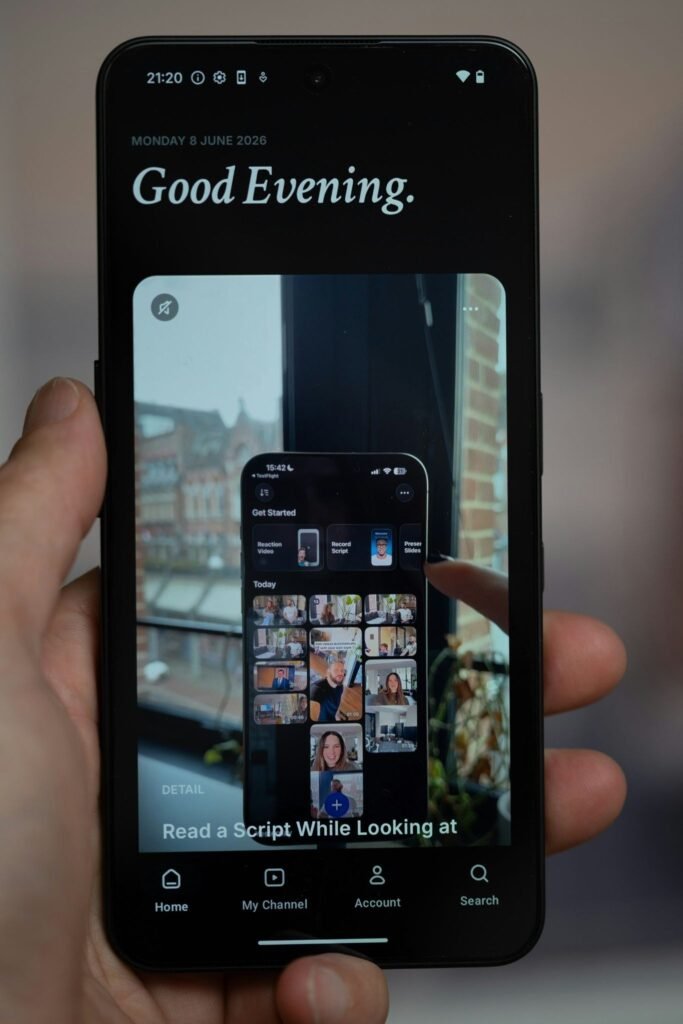
Image via Detail .co on Unsplash
| Styled words earn a second look. In a fast feed, a few of them separate a scroll from a click. |
Read Also: Future Trends in AI-Powered Mechanical Testing
How to Use AI Text Effects to Make Content Stand Out
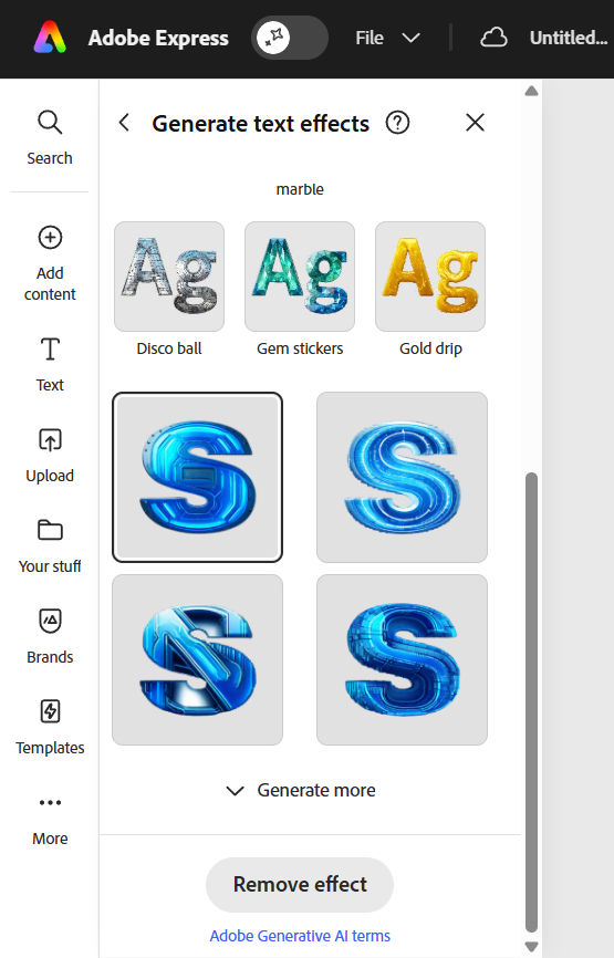
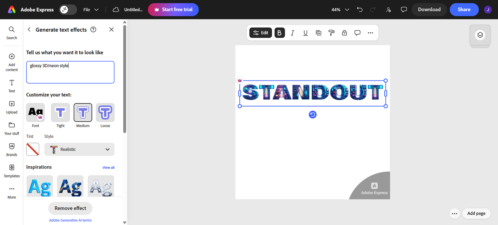
Image via Adobe
Here is how to use AI text effects, from picking a tool to exporting the file.
1. Choose a Generator
Start with a generator that turns your prompt into styled text. Adobe Express offers a free AI Text Effect Generator. You type a description and get four versions to refine. It is a simple way to enhance your content with AI text effects, requiring no design experience.
2. Write a Clear, Specific Prompt
In plain language, describe the look you have in mind. Start by stating the material or theme. Then you can mention a couple of details. The more vivid your description, the closer the finished piece will be to what you want.
3. Refine the Font, Fit, and Style
Select a font and font size that are both legible and aesthetically pleasing. Some fonts are easier on the eyes than others. Some even have an artistic flair. A block font, for example, goes quite naturally with a textured paper effect, whereas a thin script could look too weak. Create a couple of drafts by mixing and matching different combinations of font styles and font sizes, and keep the one with the most readable and legible font.
4. Export for Where You’ll Post It
Save the video or a still image in the file format your selected platform supports, usually MP4 for video and JPEG or PNG for stills. Choosing a transparent background file format will make your image words more natural in the photo background. You can adjust the size of your image to fit on the platform you use so that no part gets cropped.
Where Digital Creators Use AI Text Effects
Styled text works best where a few words must grab attention fast. A handful of go-to spots:
- Video thumbnails and titles: A styled video title will definitely increase clicks, as long as it remains legible on a phone.
- Social headers and story stickers: Choose a style that matches your brand colors, and keep in mind the platform’s safe zones (e.g., Instagram’s).
- Marketing banners and email headers: Turn a plain offer line into something people notice.
- Presentation and lead-magnet covers: A bold cover title sets the tone before anyone reads a word.
Static text suits busy feeds. Animated text earns a hook or intro, where movement pulls the eye.
| Where do styled headlines work best? Anywhere a short phrase has to stop the scroll: thumbnails, headers, banners, and covers. |
Read Also: From Local to Global: How Dedicated Server Hosting Scales Your Infrastructure
Keep Your Text Readable and Accessible
If the text’s style only makes it hard for people to read, it is not a good one. These guidelines will help you keep your words sharp:
- Make the color contrast as strong as possible. The text should be distinguishable from the background it sits on.
- Use one to three words. Effects shine on short phrases, never full sentences or body copy.
- Hold a legible size. If letters shrink too far on mobile, the message goes with them.
- Use one effect per asset. Competing styles fight each other, tiring the eye.
- Add alt text and keep a plain-text version. Styled text is rendered as an image, so search engines and screen readers cannot read it.
A stylized headline is often the only text on a graphic. When it is, you lose readers who use assistive tech and the search visibility that plain text earns. A short alt description fixes both.
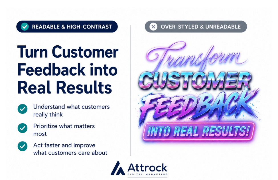
| Readability comes first. Keep effects to a few high-contrast words. Pair any image text with a plain-text or alt-text version. |
Common Mistakes to Avoid
The most common mistake is to place more focus on the style than on the message. Here are a few more worth dodging:
- Over-styling: Too many effects, colors, or shadows in one place.
- Illegible hero text: A headline so decorated no one can read it fast.
- Ignoring the background: Busy photos swallow styled words without a solid backing.
- Skipping a quick check: AI can render a letter slightly off, so proofread before you post.
- Reusing one look everywhere: The same style on every asset gets stale, and on the wrong content it feels forced.
A quick test: glance at the design for a second, then look away. If it reads, it works. If not, simplify.
| Restraint wins. Style a few words, check the letters, and keep the effect in service of the message. |
Read Also: Why Are Battery Dry Rooms Critical for Safe and Efficient Battery Manufacturing
FAQ
Q1. What are AI text effects?
A. AI text effects are AI-generated styles applied to your words, like 3D, neon, metallic, or textured type. You describe the look in a short prompt, and the generator turns plain text into a styled visual.
Q2. How do they work?
A. You type a prompt describing the style you want, and the AI applies it to your text. It matches your words to visual patterns and returns a few styled versions to choose from.
Q3. Are AI text effects free?
A. Many generators offer a free tier. Adobe Express, for example, has a free option, while paid plans add more styles and higher-resolution exports. The free version covers most everyday headlines and thumbnails.
Q4. How do you write a good prompt?
A. Name the material or theme first, then add a detail or two. “Chunky neon letters” beats a vague request. Think in categories like materials, food, nature, or textures, and keep it short.
Q5. What text works best?
A. Short phrases of one to three words. A style adds visual weight, so a headline or single keyword reads clearly. Full sentences get crowded and lose impact.
Q6. Can you animate styled text?
A. Yes. Many tools animate it and export